Plutopay is a digital wallet designed for secure, seamless, and convenient money management.
It helps users send, receive, budget, and save money anytime, anywhere.
In January 2025, I began designing Plutopay as part of my CareerFoundry UX Design Bootcamp. The goal was to create a secure, seamless digital wallet to help users manage money, send and receive payments, and track expenses — even without internet access.
Through user research, testing, and iterative design, I developed an easy-to-use app featuring international transfers, offline wallet access, budgeting tools, and travel rewards. This project strengthened my skills in UX research, prototyping, and usability testing while sparking a deeper interest in fintech solutions.
Additionally, I gained hands-on experience in visual design, color theory, design systems, UI design, accessibility standards, emotionally engaging interfaces, and developer handoff, further rounding out my end-to-end product design capabilities.
SUMMARY
MY ROLE
Lead UX/UI Designer in a 4-month CareerFoundry Bootcamp project.
January 2025 – April 2025.
DURATION
Hira Yasir (UX Designer), Matthew Schneider (CareerFoundry Mentor & Senior UX Designer), Kelly Mattingly (CareerFoundry Tutor & Senior UX Designer)
Stakeholders
Pen & Paper, Figma, Adobe CC, Miro, LucidChart, Lyssna, Zoom
TOOLS
My Process
PROBLEM
Many people need a secure, simple way to transfer money internationally, manage finances, and make purchases without relying on credit cards. Travelers and digital-first users often struggle with fragmented financial tools, leading to challenges in managing expenses, sending money, and setting savings goals — especially in areas with limited or no internet access. This creates unnecessary financial stress and limits users' control over their money and spending habits.
How might we simplify financial management and help people feel more in control of their money anytime, anywhere?
How might we reduce financial anxiety and make digital money management seamless and accessible?
User Insights
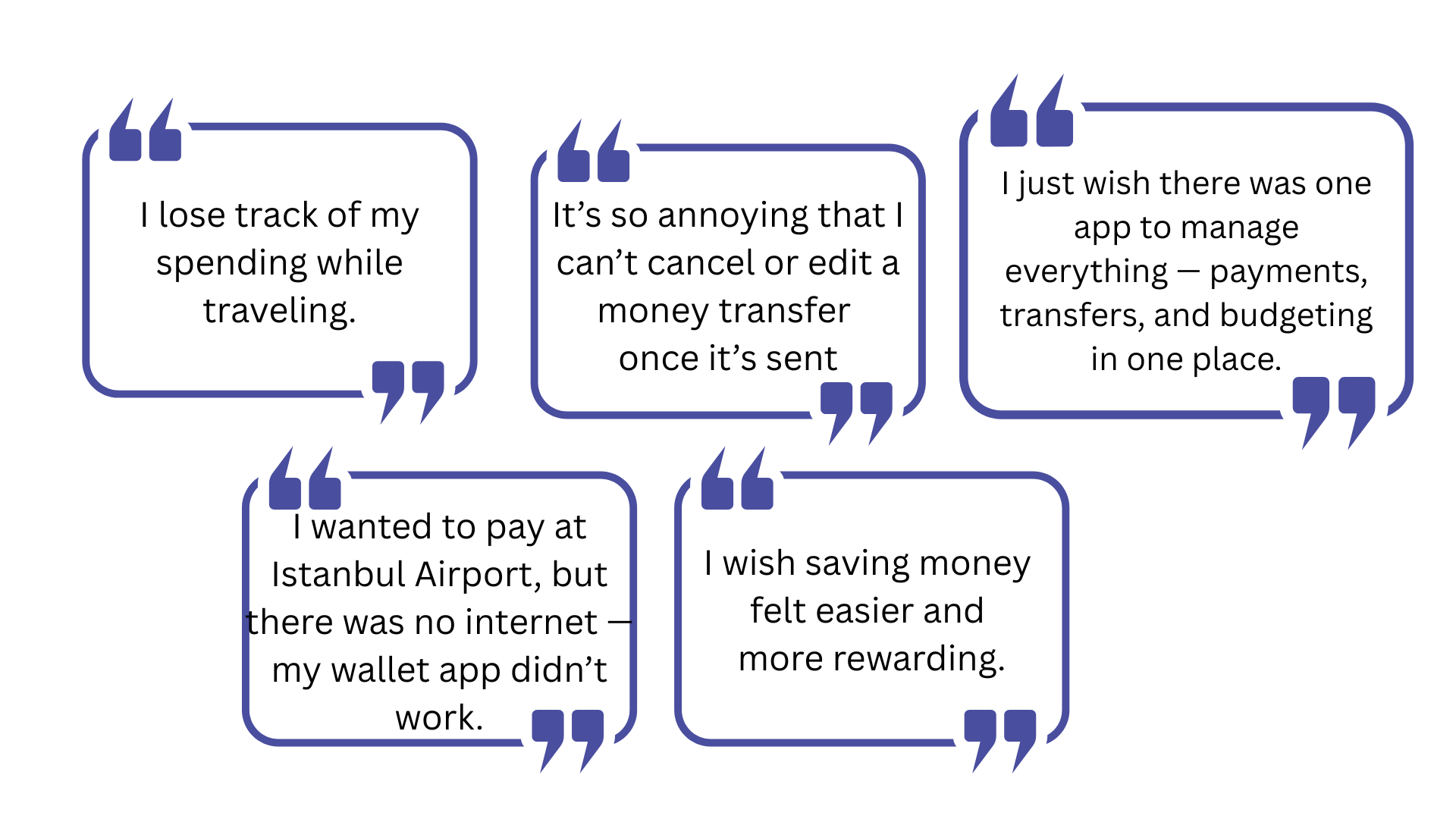
User Voice
UNDERSTAND
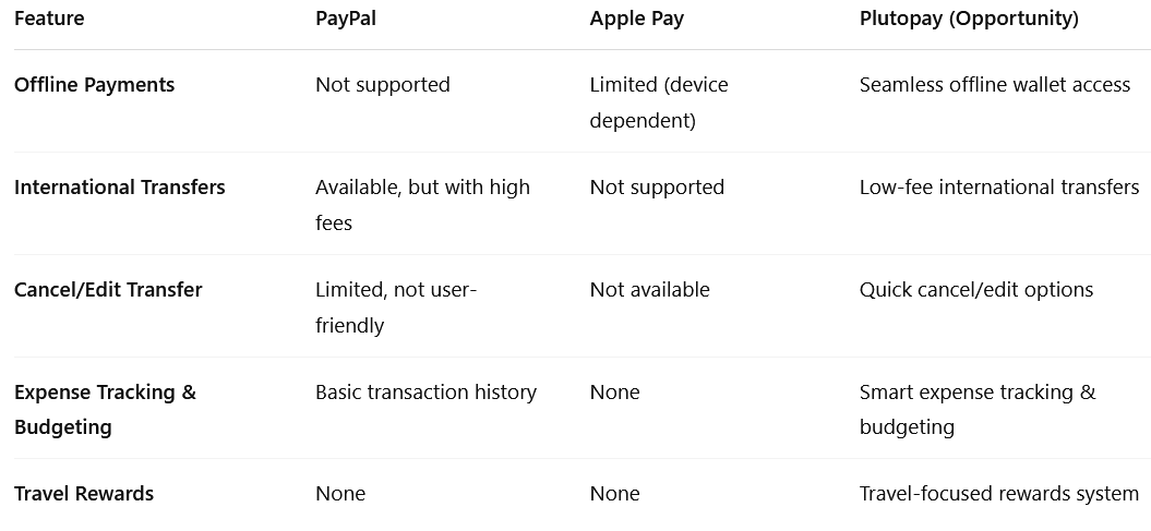
📊 Competitive Analysis
To better understand the current digital wallet landscape, I analyzed two leading competitors: PayPal and Apple Pay. This helped identify gaps in the market and opportunities for Plutopay to offer a more user-centered solution.
Key takeaway:
Both PayPal and Apple Pay lack offline access, flexible money transfer controls, and tailored features for travelers — clear areas where Plutopay can stand out.
User Interviews
& Surveys
At the start of this project, I conducted 3 in-depth user interviews via Zoom as my qualitative research method. The participants were frequent travelers, and for them, using an e-wallet app was an essential part of managing money abroad. These interviews helped uncover pain points around money transfers, offline payments, and budgeting on the go.
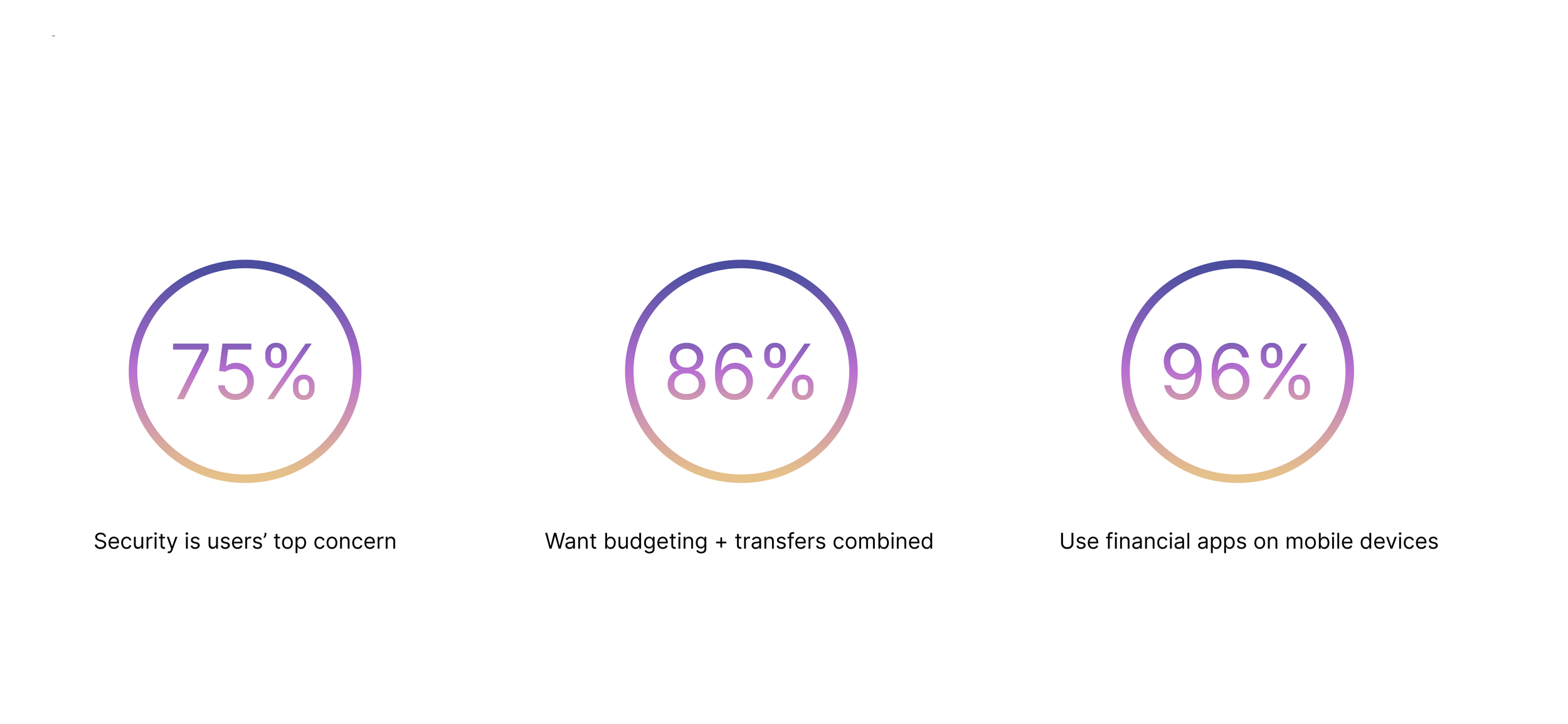
To gather quantitative insights, I also ran a Google Forms survey and received multiple responses from a wider audience. The survey helped validate patterns and preferences identified during interviews and provided additional data on users’ habits with digital wallets.
PARTICIPANTS
03 Interviews (Zoom)
20 Multiple Survey Responses (Google Forms)
AGE GROUP
25–50 year olds who actively use digital wallets for travel and daily expenses.
GOALS
Understand how, when, and where users rely on digital wallet apps.
Identify common frustrations and limitations in existing e-wallet tools.
Discover which features users would find most valuable in a payment app.
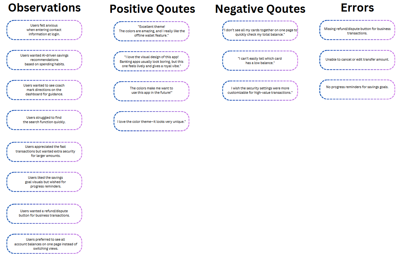
Affinity Map
Business Requirements Document (BRD)
As a foundational step, I created a Business Requirements Document (BRD) with guidance from my mentor and tutor. This helped align project goals, define success metrics, and scope out essential features for PlutoPay.
Some Initial Insights
DEFINE & IDEATE
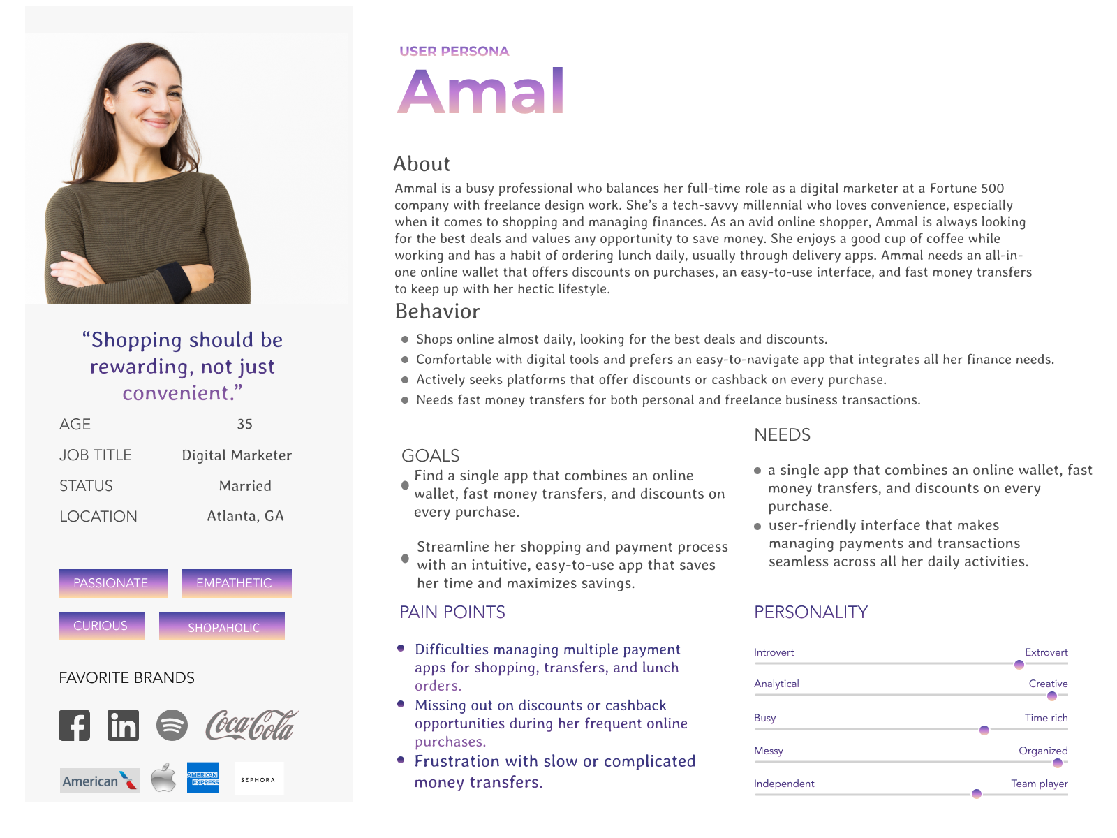
User Personas
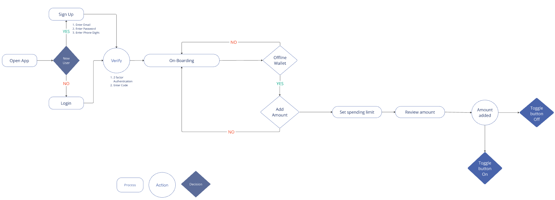
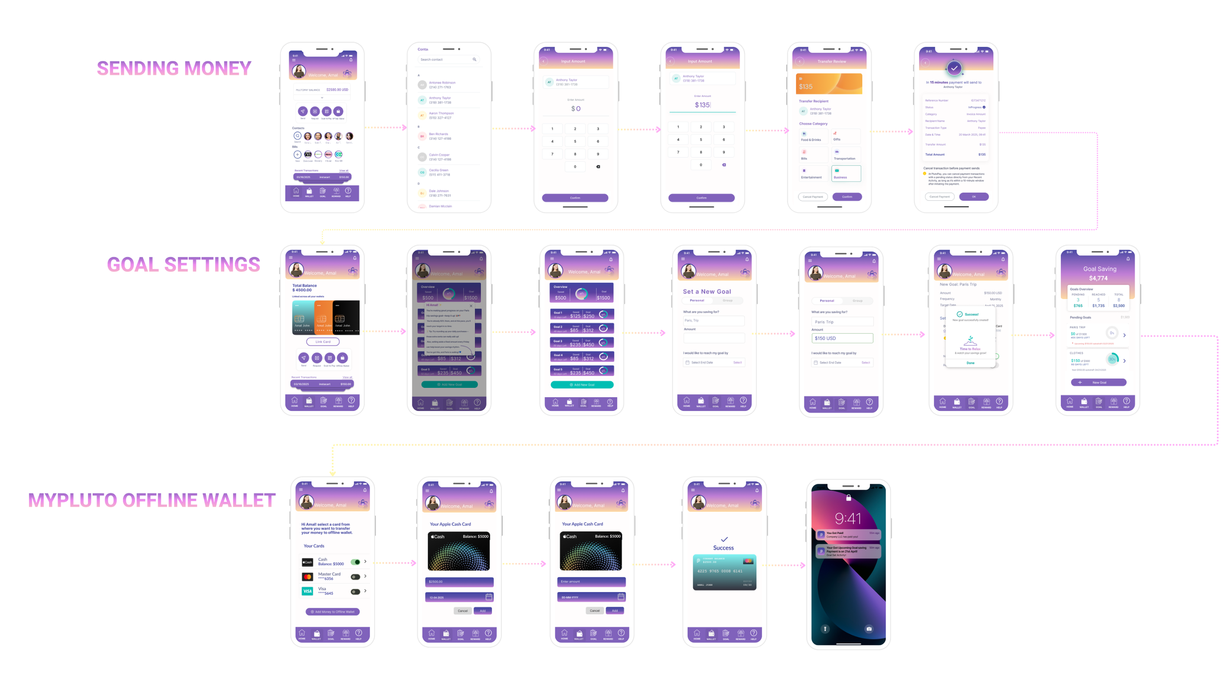
User Flows
I created 4 user flows
ACCOUNT CREATION, SEND MONEY, OFFLINE WALLET, and GOAL SETTING.
Showing the two most essential here: SETTING GOALS and OFFLINE WALLET.
OFFLINE WALLET USER FLOW
GOAL SETTING USER FLOW
PROTOTYPE & USABILITY TESTING
The usability test uncovered several critical issues.
Click the button below to view the Usability Report, hear the User Voice, and see How I Tested.
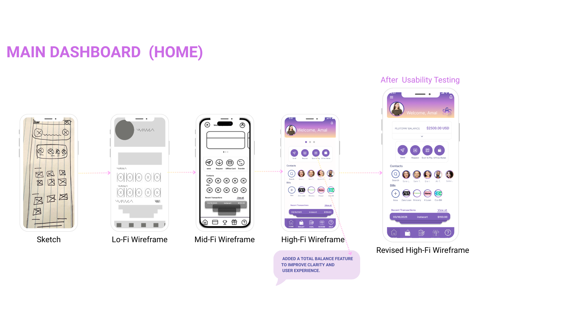
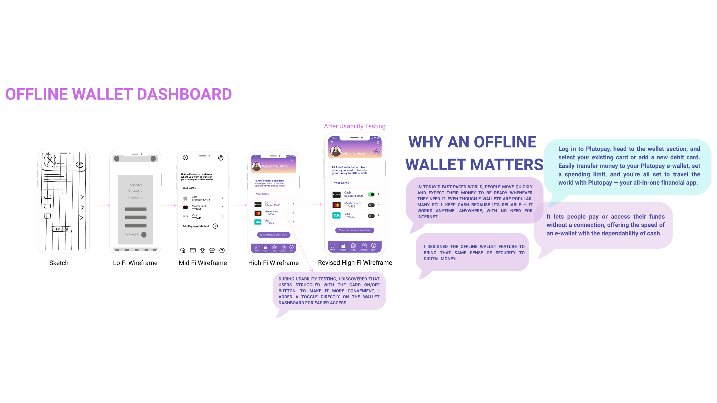
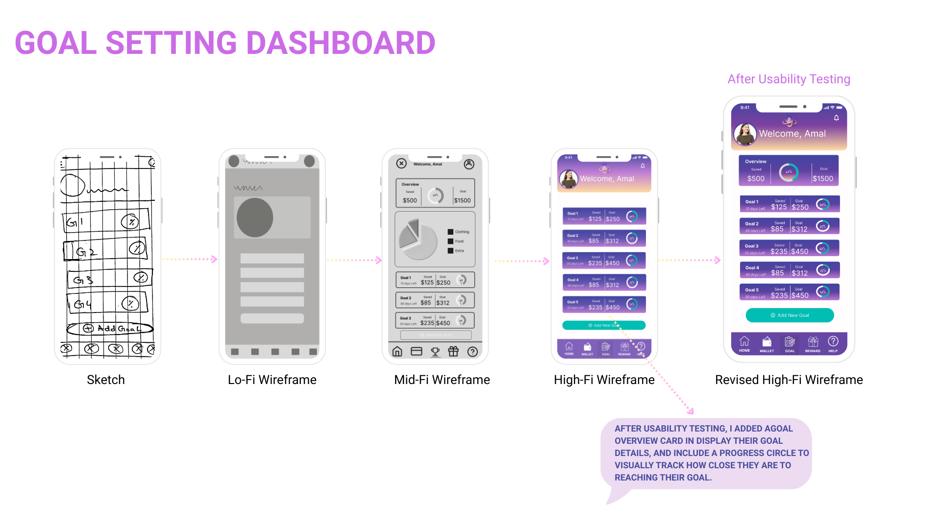
Low Fidelity Wireframes to High Fidelity Wireframes
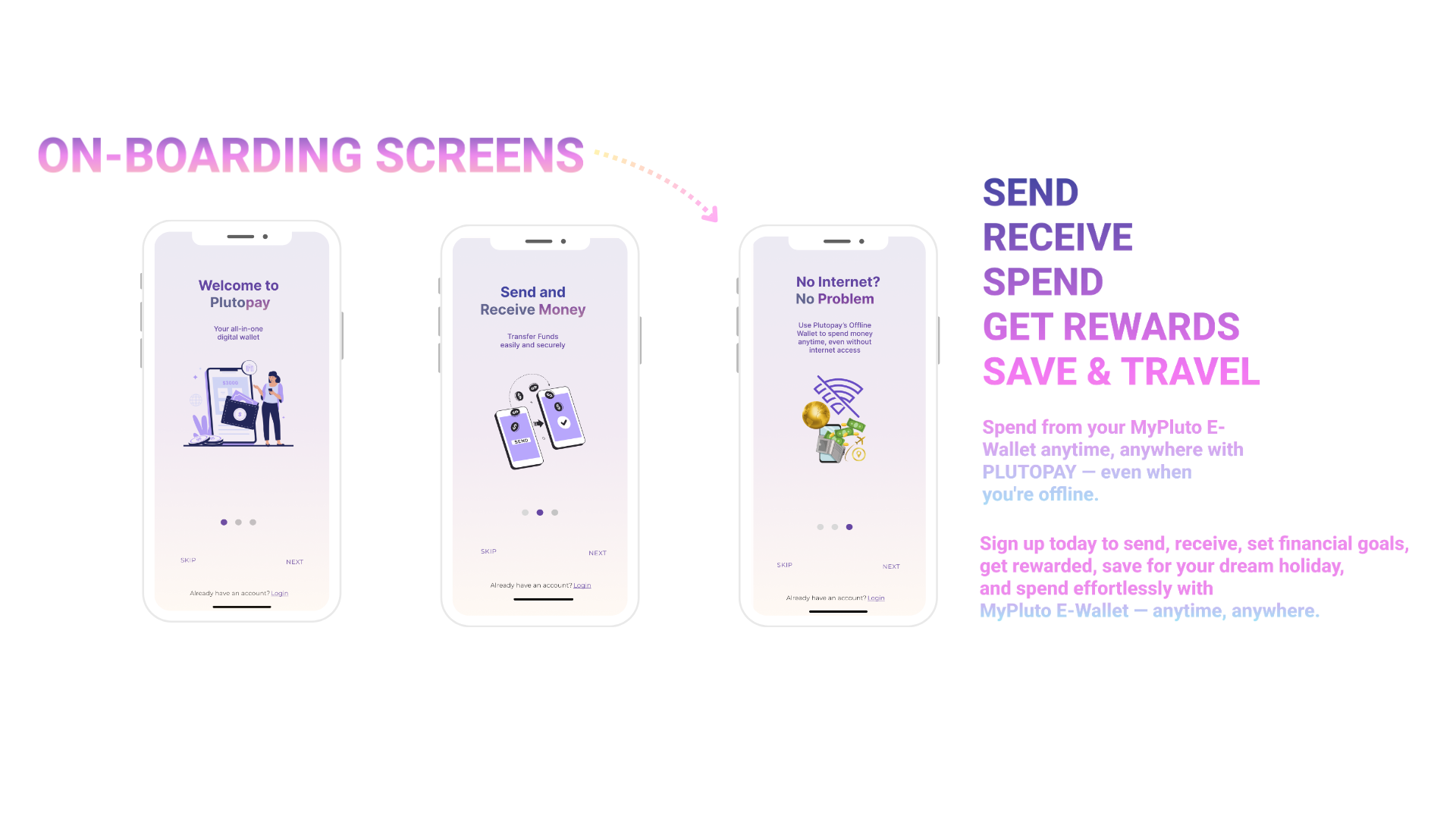
A/B Testing
I conducted three A/B preference tests using Lyssna to evaluate visual and UX/UI elements within the PlutoPay app. A total of 7–9 participants responded to each test. The purpose was to gauge user preferences for design choices across onboarding and dashboard screens.
VALIDATE
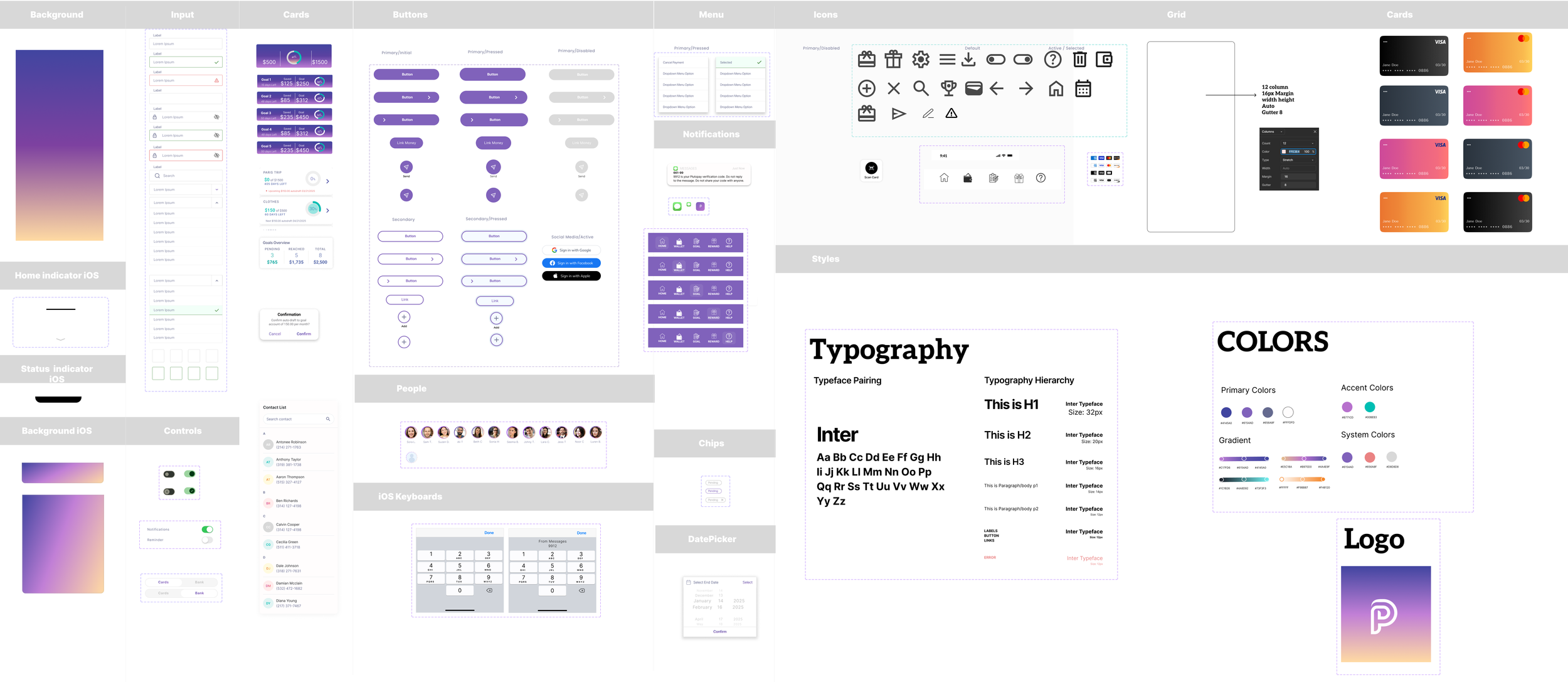
UI Design System — Components, Styles & Visual Assets
Final Product
LESSON LEARNED
During the Plutopay project, I learned how important it is to stay focused on the main problem you're trying to solve. It’s easy to get excited about new features, but that can distract from building something truly useful.
User feedback was also a key part of my process. It helped me make better design decisions and revealed new challenges I hadn’t considered. About two-thirds through the project, I realized one of the biggest issues with digital payments: people use multiple apps like Apple Pay, PayPal, and budgeting tools, which makes it hard to track spending in one place. That insight helped me think about how Plutopay could stand out—as a tool that brings those features together into one digital wallet focused on budgeting and financial clarity.
The design process taught me that a project is never really “done”—there’s always room for improvement and new ideas.
FUTURE HIGHLIGHTS
Looking ahead, one of the key features I’d like to add is bill pay. While I focused on budgeting and saving in this version, integrating bill management would make Plutopay even more helpful. This would support the goal of creating an all-in-one financial tool that combines the convenience of apps like Apple Pay and PayPal with deeper financial insight.
Envisioning what users truly need
Site Map Before Card Sorting
CARD SORTING
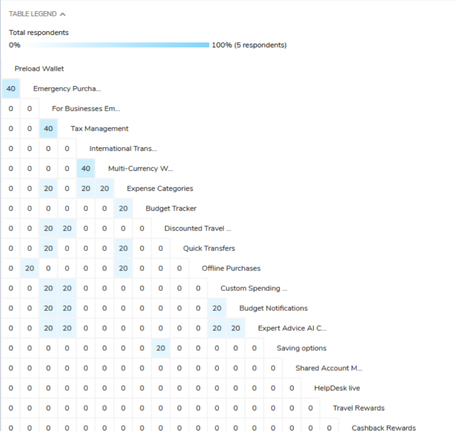
To understand how users naturally group financial features, I conducted a card sorting test with 5 participants via UXtweak.
Key insights:
Users grouped Preload Wallet and Emergency Purchases under travel-related finances.
Expense Categories were consistently paired with budgeting tools.
Rewards, savings, and transfers were clustered together.
This informed my sitemap redesign, dividing features into clear, intuitive sections:
Travel Finances, Expense Management, Payments, Rewards, and Support.
Site Map After Card Sorting
After card sorting, the sitemap was reorganized to better reflect user mental models. Key goals like Balance, Rewards, and Track Your Spending were promoted to top-level categories, making them easier to access. The navigation became more goal-oriented and user-friendly, with clearer categorization and prioritization of tasks based on what users care about most.
Low-Fi & Mid-Fi Wireframes
Before card sorting, the sitemap was structured around actions and features like "Send", "Request", "Wallet", and "Savings", with financial tools and settings nested deep under sections like “Profile” and “Mobile Menu”. Important user goals such as checking balance, tracking spending, or accessing rewards were not clearly highlighted, making navigation less intuitive and task discovery more difficult.
Sketches
Lo-Fi
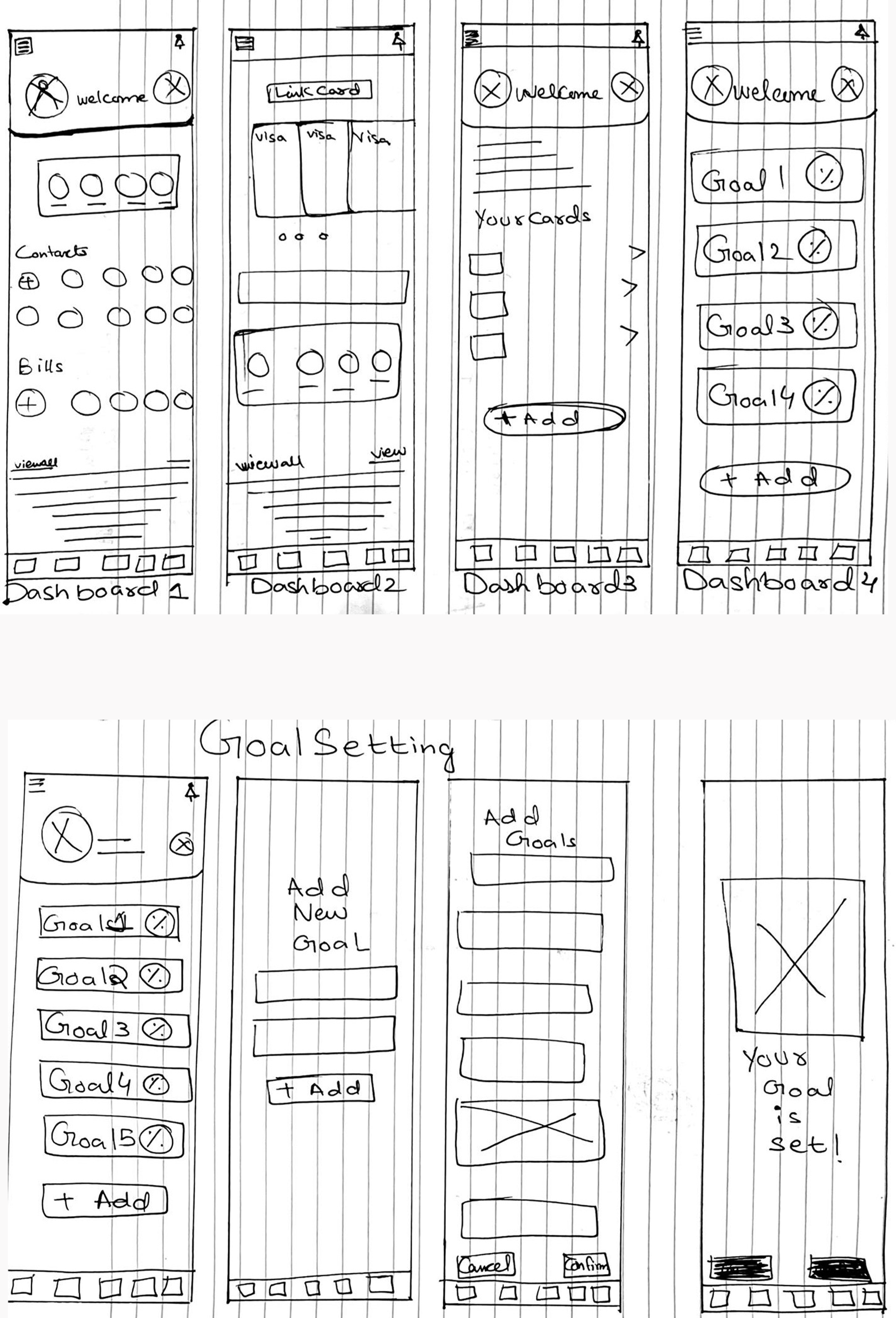
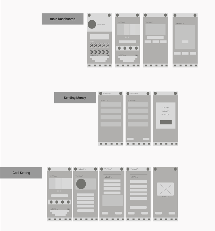
In the ideation phase, I explored multiple low to mid-fidelity wireframe variations. Through user testing, I iterated on layouts, icons, and text to enhance usability. Gestalt principles guided the design choices, ensuring key actions and information were clear and easy to access.
I’m showcasing a selection of sketches and Lo-fidelity, mid-fidelity wireframes here from the larger set created during this process.


